Watching the colour trends throughout history is very revealing and says a lot about what is happening for humanity.
As an example, when we look back at times of economic depression and insecurity ,
such as the 30's and 40's we often see browns and greys featuring heavily in furnishings and fashion.
The 60's came in with a wild explosion of orange and lime...colours that relected our newfound sexuality (orange)and sense of adventure (lime). This was an era when we felt a lot more comfortable talking and openly communicating (orange) about the taboo subjects (sexuality and emotions - orange) that were kept behind zippered lips in the sedate 50's.
The 70's featured a vast array of purple tones which spoke of a time of revolution...of seeming chaos that followed on from the 60's.
The 80's saw a lot of women choosing deeper red shades (physical energy) for clothing and accessories as they asserted themselves in the traditionally male workplaces and institutions (remember the 'Dallas' style extra wide shoulder pads!!!!)
Colour trends change much more quickly now. We are able to go out and find just about any colour we want although trends are still set. We have recently seen a return to the neutral browns, greys and stone colours and guess what?..... here we are again in that place of worldwide economic uncertainty.
It was really heartening to read the press release from Pantone recently that declared the colour of the year for 2009 to be Mimosa - a striking yellow with slight golden tones.
Here is an excerpt from the press release (highlights in bold by me!)
"Pantone Selects Color of the Year for 2009: PANTONE 14-0848 Mimosa
Mimosa Embodies Hopefulness and Reassurance in a Climate of Change CARLSTADT, N.J., Dec. 3, 2008 - Pantone, an X-Rite company (NASDAQ: XRIT), and the global authority on color and provider of professional color standards for the design industries, today announced PANTONE® 14-0848 Mimosa, a warm, engaging yellow, as the color of the year for 2009.
In a time of economic uncertainty and political change, optimism is paramount and no other color expresses hope and reassurance more than yellow. "The color yellow exemplifies the warmth and nurturing quality of the sun, properties we as humans are naturally drawn to for reassurance," explains Leatrice Eiseman, executive director of the Pantone Color Institute®.
"Mimosa also speaks to enlightenment, as it is a hue that sparks imagination and innovation."
Best illustrated by the abundant flowers of the Mimosa tree and the sparkle of the brilliantly hued cocktail, the 2009 color of the year represents the hopeful and radiant characteristics associated with the color yellow.
Sounds good to me!
Tuesday, December 9, 2008
Will a golden tone create a golden age?


Wednesday, November 5, 2008
What colour is Hope?
I am an Australian and I don't usually show such a great interest in the politics of other countries but yesterdays election in America had me riveted. The underlying feelings of hope for the future during the broadcasts yesterday were hard to ignore.
It led me to ponder..."what colour is hope?"
It must contain a touch of blue ... lets hope.....
Thursday, October 9, 2008
Beware the tricks of colour!!!!!!
I was absolutely furious with myself!! I had fallen for one of the sneakiest tricks and I should have known better. If it weren't for the fact that I was in such a hurry I am sure it wouldn't have gotten past me.
Yes!....I had fallen for the old trick...!!!!!
I can't believe it! I also can't believe that food sellers are allowed to get away with it.
Has it happened to you before?
You rush into the supermarket just before dinner time...you think to yourself.."quick... what will I grab for dinner...Mmmm... potatoes will do"
You grab a bag and throw in a bag of carrots and some meat in a pre pack to round it off then dash to the checkout, race home, turn on the oven, open the bag of potatoes and.....THEY ARE ALL GREEN!
DAMN! How did that happen? They looked o.k at the store. "Oh well" you say ."I still have some carrots and some meat" Ha! You open the carrots and they look a bizarre shade of brown! You turn nervously to the meat thinking "uh oh looks like this will be it for dinner" and Double Damn!!!!! What looked like a nice tender piece of steak suddenly has taken on the appearance of a century old relic found in the ice melt on the North Pole!!! EEEKKK. There goes dinner and some hard earned cash that you payed for it with!!! Looks like cheese on toast to eat tonight!
NEVER...I repeat NEVER buy potatoes if they are in a pink bag. It is an old trick (in reverse)that I learned years ago when I worked as a make-up artist. We used to apply a green base to peoples skin (to cut back a too rosy glow) before applying a normal foundation. It works a treat. You see... Red and Green are opposites so one will counteract the other! Fine for making you look good but downright deceptive to try and make potatoes saleable!
As to the carrots and meat...well..these sneaky marketers are putting old carrots in orange bags to make them look fresh and new and the butchers departments have sneaky pink based lights in their display areas to make the meat look nice and pink and fresh.
Here is the tip. Look at your meat selections away from the display area...find some normal lighting to check it out and never buy your vegies in bags!!!!
I vow to never fall for that trick again!!!
I hope!
Sunday, August 24, 2008
Massaging the Chakras
I often get asked ..” how do you use colour as a therapy?”
To answer that question could take me hours as there are so many ways to utilise colour to heal and grow.
There are many different colour based therapies available but the one that seems to have really grabbed me is AuraSoma. I really love this system because of its non intrusive and self selective basis.
Ultimately your client chooses the colours that are perfect for them at this point in their lives and their choice comes from within a deep part of their unknown self.
Their colours are chosen from a huge range of over 100 different jewel like bottles of coloured oils and essences. Consultation about their choices then takes place and the client leaves with the bottle (or bottles) that are to be applied to the matching chakra areas as part of the whole process. The bottles contain a mixture of essential oils, gem and crystal essences, herb and plant essences as well as the energy of colour
and are called Equilibrium Bottles and through them the ultimate goal is...to restore equilibrium to body mind and soul!
Some practitioners of the AuraSoma system have gone on to develop further therapies. One Practitioner and Teacher friend of mine, Vicki Engeham, has developed an amazing system called Chakra Massage and has just published her long awaited book all about it.
I had a chat to Vicki just recently and asked her a few questions about her journey with colour....
Vicki, how long have you been working with colour as a therapy?
...I've been working with colour as a therapy since 1992. Before that I was a potter/artist and window design person. So really colour has been a theme through my life as such.
Do you have any success stories from your years as a teacher and practitioner?
...I have many success stories that I usually share when I teach. I have found colour to help with all areas of life, be it spiritual,emotional or physical. I have worked over the years with people with aids, cancer and many life threatening diseases through touch and colour. Colour has proven to have been extremely helpful with people that have been abused. What I like about Aura-Soma is it is non intrusive, so a person works with a particular bottle of colours, to help address his/her issues. The responsibility then is given back to the person to continue to work on themselves.
Where are you based?
... location is in Central Australia, has been for over 25 years, maybe Cairns for the next lot. I really think you can work anywhere if you know your subject well, although it's nice to have a base.
I know you frequently travel to places such as Japan and the U.K to teach courses but are there any other countries that you would really like to bring your work and knowledge to?
... I mainly teach the 3 levels of Aura-Soma courses these days. I also teach the chakra balance course as well as deep relaxation massage, advanced skills and shiatsu. I teach all over Australia, Europe,Asia and Japan. I travel a lot.
I'd like to have the opportunity to travel to China to teach.(when i find time!)
How did you develop the concept and practice of Chakra massage?
... The chakra massage developed through a dream, then put into practice. First came the technique, then came the sound, breath, Angels and crystals.
I'd like to add you don't have to be "SPECIAL' to do any kind of healing work, just the intention of working for a person's highest good.
Vicki’s book is available by contacting her directly via her website or through visiting the AuraSoma Australia website.
Who knows she may also be able to travel to your area to teach and share her wonderful knowledge and skills!
Wednesday, July 16, 2008
Feeling S.A.D!

It is mid winter here in the southern hemisphere and the temptation to stay indoors and hibernate is high! Outdoors is bleak and cold and the landscape seems to have lost some of its colour. It is a time when we can easily stake a claim to a comfy corner of the lounge,put the heaters on high and work our way through the stack of dvd’s calling to us from the tv cabinet.
For a lot of us (females) it is a time to let the hairs on our legs grow to the point where, come spring, we need a deforestation permit from local council to wax or shave them off! We might poke our head out on a chilly winters day, mutter a quick bbrrr and quickly come back in to make another hot chocolate.
This is all right and proper. We are following the natural cycles of the seasons and life. Winter is the time to let the fields lie fallow awaiting the return of spring and the traditional beginnings of new cycles of growth and life.
But wait....we are not bears...we are not meant to fully hibernate...we are human beings! We need fresh air, movement and most importantly ....LIGHT! (and yes!..hot chocolate!)
Our bodies rely on light for so many things. We need it for vitamin D synthesis, hormonal regulation and mood balancing.
We are solar powered beings that respond to light. Food and water help too of course but without light we would wither and die.
Sunlight gives us our measurable wavelengths and vibrations of colour. Each colour vibration found within sunlight ‘feeds’, balances and energises the energy centres , or chakras of the subtle anatomy of the human being which then influence our glandular system and hormone levels. If we shut out the sunlight we deny ourselves this vital energy source.
There is a condition called S.A.D or seasonal affective disorder that is directly attributable to prolonged low levels of natural sunlight.
This condition is more prevalent in some countries of the Northern Hemisphere where winter day light hours are short and the quality of light weak but it is also becoming more prevalent due to the demands of modern day life.
In winter, people who work in offices all day might arrive in the morning, spend all day inside an artificially lit building and then leave again at the end of the day when it is dark, having little or no exposure to natural light. As sunlight is vital to hormonal balance, what results is imbalanced hormone levels which can then lead to sadness and depressive states.
So! If you are feeling a bit down and gloomy this winter add some colour to your life. Brighten up your wardrobe. Add some splashes of colour to your home and head outside as often as you can for a healthy dose of light and colour therapy!
Thursday, June 19, 2008
Colour at work….not just for the décor!
As workplace mindsets change to adapt to evolving needs of the new generation…Generation Y, employers and their Human Resources teams are needing to find a whole new way to engage and retain employees.
More and more companies, including Government agencies and even local councils, are investing in and strengthening their workforce by including courses and workshops based on wellbeing and personal growth.
One company that is offering such courses is breathe:HR.
Suzanne Saad, the founder of breathe:HR, has created an amazing range of courses and workshops. These courses incorporate Suzanne’s incredible range of skills and truly are the answer for what is happening in the corporate world now.
Suzanne has been a friend and fellow Colour Practitioner for some years now and her skills in Art Therapy, Colour Psychology and the AuraSoma Colour Care system for personal growth are extensive.
Suzanne offers a variety of workshops and courses as well as one on one sessions to enable employees to find personal meaning in their working life, see value in their work and be able to express their individuality.
The best part of this is that one of the main tools that Suzanne uses is COLOUR!
I am really excited to see colour being used to it's full value in this way. People like Suzanne are bringing colour and it's uses into the mainstream and this is awesome!!!!!
Take a few moments to have a look at Suzanne’s very informative website.
While you are there, check out her articles section for a wonderful explanation of the AuraSoma Colour Care system!
Friday, May 30, 2008
Feeling Guilty...?
Guilt = Gilt (gold).
The only difference is ‘u’!!!
Guilt likes to resides within our golden area.
The area where, from within ourselves, we can recognize our true worth, our innate wisdom and our sovereignty. It likes to disturb and question our self value.
It likes to elevate our levels of fear so that ego can keep control.
It likes to boil the pot of anger, resentment and blame.
Does it serve us to hold onto our guilty feelings for our perceived wrong doings?
Short answer...it doesn’t... so let it go!
Long answer... Guilt is a feeling.
Guilt resides with fear...fear of judgment, of being seen as ‘bad’ or as a lesser person.
(“Guilt is anything you did and fear others to know about” Author: Mohammad)
Feelings are communications and guidance from our higher self to our earthly self showing us areas within us for potential growth.
Feelings are the opportunity for the process of alchemy to turn lead into gold.
In the case of feelings of guilt we are being asked to firstly be aware where we have made an error of judgment and have chosen an action or deed that has not been in the higher interests of all (is one!).
We then have choices on how we will deal with things. We may brush it off with statements like “I don’t care” “ He/She/They deserved it” etc etc... but this will surely just bury the feeling deeper for it to surface again at a later date or perhaps to manifest physically as illness and disease.
OR
We can accept what has caused our guilty feelings. Truly and honestly accept the part we have played in creating these feelings.
We can own it and admit to it (most importantly to ourselves) and make amends for it if need be.
(“It is the confession, not the priest, that gives us absolution” Oscar Wilde )
and then move on....
Once we have done this we have taken 'u' out of guilt and turned it to gold!
From The Miriam Webster Online Dictionary:
GILT
Pronunciation:
\ˈgilt\
Function:
adjective
Etymology:
Middle English, from past participle of gilden to gild
Date:
14th century
: covered with gold or gilt : of the color of gold
GUILT
Pronunciation:
\ˈgilt\
Function:
noun
Etymology:
Middle English, delinquency, guilt, from Old English gylt delinquency
Date:
before 12th century
1: the fact of having committed a breach of conduct especially violating law and involving a penalty; broadly : guilty conduct
2 a: the state of one who has committed an offense especially consciously ,
b: feelings of culpability especially for imagined offenses or from a sense of inadequacy : self-reproach
3: a feeling of culpability for offenses
Sunday, May 11, 2008
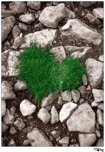
The Greening of Humanity
There has been a marked movement towards green...
yes we already know that don't we...
...it's all about the environment, saving our forests, searching for fuel alternatives, pollution etc etc.
Well NO, it is not just about the environment.
The Green movement is happening in many different ways.
Let's just put the idea of green being about the environment aside and take a wider look at the meaning of green.
The vibration of green relates to out heart centre, our heart chakra. Green is all about decisions, feelings, balance and love.
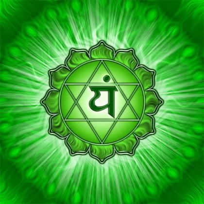
Green opens us to expansiveness and feelings of spaciousness and to an ability to make decisions from our feeling side rather than our intellect.
I made the conscious choice to work with the colour green about a month ago. I 'put out the call' so to speak that I was ready to work through another layer of my own green issues . This meant being open to my feelings and allowing my guidance to come from my heart. It even meant looking at issues that might bring out the green eyed monster of jealousy and envy (which certainly put in an appearance!)
Well the call has certainly been answered. I have had an amazing wave of green come to me in many different ways.
What I have witnessed and can now see very clearly is the 'Greening of Humanity' No ..I don't think that we are being invaded by little green men but there is a green under swell occurring that is showing people of the need to choose their actions and make their decisions from heart based values.
Many businesses are are now looking at the 'heart line' instead of the bottom line.
One of many examples that have come my way has been the website called Heart of Business.
I urge you to have a look at what Mark Silver, the founder of this site, has to offer. His work is about getting in touch with your heart to find direction and answers that can not only be applied to your business but also to any aspect of your life.
Another instance of 'green' came to me as I was watching an interview with Andre Rieu, the violinist, the other night and something he said during that interview really resonated for me. He was asked what made him such a success and he replied
" I play music from my heart and that is what makes it successful"
Now that statement really felt right to me!

You heart can express your passion and in your passion is your truth, connection and purpose!
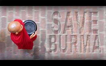
One of the most obvious and biggest calls for humanity to go green has been with the natural disaster in Burma. Not only was this a green event in relation to the environment but it is also a huge call for the governing authorities of that country to open their hearts to receive the outpouring of caring and love from the rest of the international community. Will the Burmese government open their hearts? Who knows? To truly allow your heart to open requires trust and to let ourselves be open to receive is for some of us one of the hardest lessons to learn.
Actions and decisions made from the feeling side of our being resonate with truth, our own personal truth and therefore can see us leading a more authentic life filled with love, honesty and compassion. When we connect in this way everything we do seems to shine that little more brightly.
Our hearts are where we can connect to our inner guidance...a place where we hold all the answers we seek.
Sunday, April 6, 2008
The Rainbow Road to Happiness.
 Live your life with passion and energy!
Orange
 Examine where in life you are co-dependent…relationships, habits, beliefs, substances and work towards understanding inter-dependence and independence.
Yellow
 Learn, learn, learn! You are never too old to learn something new.
This road leads to expansion and understanding.

Green
 Make decisions from the space of your heart.
This road leads to love (given and received).

Blue
 Blue Be truthful in your communications.
Indigo
 Trust your intuition.
 Allow yourself to always be inspired and use your imagination!
This road leads to connection with your purpose.

Explore all these roads and they will lead you to the gift of the rainbow
and a life lived to the fullest potential!
All contributed content © Leanne Lonergan
Tuesday, March 25, 2008
Favourite Colour votes are in!
There was a total of 66 votes and here are the results.
Definitely not an all conclusive study but an interesting exercise no less.
Most of the votes below came from artists and crafters from Etsy.
(The color palettes you see below were put together on ColorLovers. Definitely a site that is top of my list!)
Yellow - NO VOTES
Grey - NO VOTES
White - NO VOTES
Pink - 1 VOTE
Black - 1 VOTE
Scarlet/Coral - 1 VOTE
Gold - 2 VOTES
Brown - 2 VOTES
Lime - 3 VOTES
Magenta - 3 VOTES

Red - 4 VOTES
Indigo - 4 VOTES
Orange - 5 VOTES
Turquoise - 8 VOTES
Violet - 9 VOTES
Green - 9 VOTES
and the WINNER IS...........Blue with a resounding 12 VOTES
But what does this all mean?
Our favourite colours are influenced by many things including our culture, society, family and peer groups.
Our reaction to different colours can also come from experiences that we associate with colour.
Perhaps a teacher or carer that you didn't like constantly wore a particular colour or you were forced to wear a uniform of some sort which brings unpleasant associations for you.
One story I have heard speaks of a fellows aversion to blue.
According to the story this fellow had been involved in a train crash and had been lying injured in one of the twisted and wrecked carriages for some time.
All he could see was a blue light (some sort of emergency exit light or the like) shining near him.
He became totally adverse to blue after this as his thoughts associated this colour to his experience in the train.
Sometimes we can have an intense aversion to a colour but it's logical cause is unknown to us...perhaps it comes from an early experience that has been repressed and buried.
I once had a student in one of my classes who really had a strong dislike of blue also.
After we delved into this for a while and explored the deeper symbolism of the colours, she came to understand that she preferred to be surrounded by people who were highly independant and self sufficient and that were energetic and motivated (all things that relate to a 'red' person - which was her favourite colour) and that blue represented for her the antithesis of this.
I followed a thread recently in the forums on Etsy where the majority of people commenting noted their dislike of the colour yellow.
This shows in the results of the this poll also.
Yellow is about us being in our own 'power' free from the fears that hold us back!
The following quotation is from Marianne Williamson. To be precise, it is from her 1992 book, "Return to Love" (hardcover p. 165, paperback pp. 190-191):
"Our deepest fear is not that we are inadequate. Our deepest fear is that we are powerful beyond measure. It is our light, not our darkness, that most frightens us. We ask ourselves, who am I to be brilliant, gorgeous, talented, and fabulous? Actually, who are you not to be?" ....
This a perfect example of our 'yellow' fear of letting our light shine.
From most of the sources I have read the fact that the poll has shown blue to be the favourite colour does not surprise me.
Blue is constantly quoted as the worlds favourite colour. A sweeping statement I know but I can't find any evidence to the contrary.
Blue is about the nurturer and carer within us. It is also about saying 'yes' to what comes our way (good or bad).
Through blue we seek peace and calm and a certain sense of co-operation. It has connotations of reliablity and trustworthiness which I guess are traits we would all like to embrace....
Saturday, March 22, 2008
Spinning wheels of colour energy…

Lying within each and every one of us are receptors and transmitters of colour. These ‘devices’ are called chakras.
There are seven main chakras and each one of these equates and responds to a different colour of the visible light spectrum and is responsible for a different function. They are the spinning ‘wheels’ or vortexes of the subtle anatomy system and in fact get their name from the ancient Sanskrit word for wheel.
The chakra system is an energy system that has been recognised by Eastern culture for many centuries and each chakra is traditionally depicted as a lotus flower with a different colour and a different amount of petals. The petals represent the vibratory rate of each chakra and correspond also to the different vibratory rate of each colour.
The seven main chakras of the human body consist of;
Base chakra – red – our connection to our physical body and life.
Sacral Chakra – orange – our emotions
Solar Plexus Chakra – yellow – our thoughts and mind function
Heart Chakra – green – our feelings and centre for love
Throat Chakra – blue – our self expression and communication

Brow (Third eye) Chakra – indigo – higher mind function

Crown Chakra - violet - our connection to our higher consciousness and inner wisdom
The chakras act in two ways – they both draw in and give out energy and act to sustain us physically, emotionally, mentally and spiritually.
Working with colour as a therapist is all about working with the chakras and the colours of the spectrum to bring vibrational balance back to the energetic system of the living being.
Every part of the body from the bones and organs right down to the smallest cells at a microscopic level has a different vibration and consequently a different colour vibration to match.
The chakras are a system that can be likened to a complex set of gears – one is dependent on the next for the system to work.
They can become dysfunctional by being overactive, under-active or blocked which in turn can lead to the manifestation of a range of physical, emotional and mental conditions.
The ideal is to catch the imbalance while it still exists at an emotional or mental level and before it manifests into the physical.
We can pick up a clue as to what colours we need at any given time by becoming aware of our colour needs, what colours are we currently attracted to and what is our reaction is to the different colours in our world.


